
| November 2006 |
|
| Scott McCloud : Making Comics | |

After Understanding Comics, it was hard to see how Scott McCloud would top himself; and indeed Reinventing Comics was a disappointment. But now he's returned to form.
Making Comics is more addressed to comics creators, though it has plenty to interest readers. It covers a lot of ground; but its main message is a challenge to create comics that are more involving: he plugs direct but more sophisticated storytelling, better drawing, more attention to body language and facial expression, and a wide range of techniques to increase immersiveness.
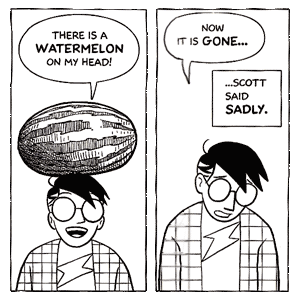
He says that he's sharing things he learned as he himself attempted to make better comics, and indeed, he's improved quite a bit. You can see it in the sample to the right, not only in the impressive technique on the watermelon, but in the more controlled and more expressive faces. In Understanding Comics Scott's icon had pretty much the same expression in every panel.
If you draw comics, what you take from the book will probably depend on your own level, and thus on what you're ready for next. For me, the most amazing section of the book is the one on facial expressions. McCloud presents the classification of facial expressions and how they mix— did you know that expressions could be classed into six basic mixable types?— and, deeper yet, how these expressions derive from the underlying musculature. Too many cartoonists are satisfied with just a few repeated expressions; McCloud shows the enormous subtlety possible with a mastery of facial expression. And as those self-portraits show, it even improves faces at the cartoon level.
I also appreciated his appeal for better art-- with some stunning examples, all the more impressive in that McCloud is no genius at drawing. Hey, if he can do it, the rest of us can, too! If he were writing for Europeans this chapter wouldn't be necessary-- the art in Euro comics tend to blow everyone else out of the water. But American cartoonists have, I think, read too many tiny and sloppy newspaper comics and use only a fraction of the resources available to them.
There's a curious reversal from Understanding Comics, which admired everybody but seemed most interested in stylistic experimentation-- his favorite artists seemed to be Art Spiegelman and Mary Fleener. Making Comics starts out with an emphasis on clarity and making audiences care about story and characters; his new heroes seem to be Jaime Hernandez and Osamu Tezuka. Maybe he thinks comics have been too inaccessible and alternative lately. Or maybe he thinks he's been that way.
There's more, much more: effective use of words; physical tools; understanding manga; yet another theory of art. There's a couple of walkthroughs of simple stories, one showing the effect of different stylistic approaches, another showing the importance of body language. If you read comics, it's a confirmation of the potential of the medium; and if you create them in any form, it's a smorgasbord of things to try out.
Throughout there are flashes of McCloud's goofy sense of humor-- my favorite was the one-panel appearance of Doodly.
| Matt Madden : 99 Ways to Tell a Story | |
 While you're at the store buying Making Comics, you'd might as well pick this book up too.
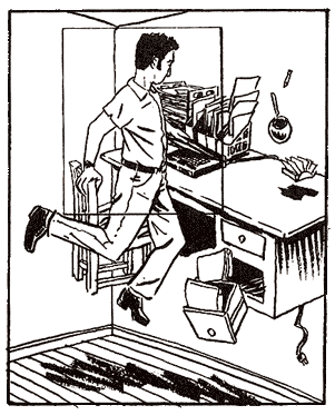
It's subtitled Exercises in style, and it's designed as the comics equivalent of Raymond Queneau's quirky classic Exercices de style, which takes a pointless anecdote and dashes it through several gamuts of changes: different registers, different genres, different tenses or voices or points of views, prose and poetry, a dozen forms of wordplay, evocations of each of the senses, use of borrowed words from different languages.
Now, Queneau has a serious point about the range of styles available to a writer, and how even a seemingly neutral style is an artistic choice, but at least half of it is just goofing around. And the same can be said for Madden. His exercises largely fall into three groups:
|
One useful corrective to McCloud, perhaps: Madden is resolutely experimental, even surreal, and he's better at this sort of thing than McCloud is. A series of variations on a purposely trivial incident could come off as cold and formal, but it's not; it's very human and often quite funny. (More so than Queneau, in fact; Exercices de style has its humor, but it's extremely dry, and there's very little human warmth in it at all.)
Something in Madden's art and even his lettering reminded me strongly of Jessica Abel, and it turns out that she's his wife; indeed, she appears in some of the comics.
