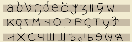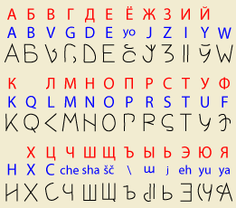
Its peculiarity is that it is simultaneously a Roman and Cyrillic alphabet.
The red letters are Cyrillic, the blue Roman, and the black Cyroman. I’ll give details below, but you can see the basic principle: letters shared by the source alphabets are retained, while the others are a graphic compromise designed to be correctly interpreted by readers used to just one of them.
The names of the letters in English are those of the corresponding Roman letter, or the name shown; but read šč as shcha, \ as hard, and j as soft. To avoid confusion, U is pronounced oo.
Numbers and punctuation are the same in both source alphabets, so I haven’t drawn them.
For the most part Cyroman shares the Cyrillic habit of making the lowercase letter a smaller version of the uppercase one, except when both alphabets have a different form. However, some letters have extenders above or below the baselines in order to add recognizability and variety.
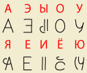
Unlike Cyrillic, however, the bottom vowels in Cyroman are designed as close variants of the corresponding top vowel. For A O U the difference is a C-like curve on the bottom vowel; for I this curve is put on the top vowel instead. The E’s are of course reversed. The idea here is to be close enough to the Cyrillic originals to be recognizable, but to suggest the correct vowel to readers used to Roman.
If you’re not used to Russian, let me explain a bit further. /da/ ‘yes’ is written да; /dʲadʲa/ ‘uncle’ is written дядя. Phonetically the difference is in the consonants, but Cyrillic very cleverly saves the hassle of having a load of consonants, or an intrusive diacritic, by marking the palatalization on the vowel letter. (The vowel sound is still just /a/.)
And to further save letters, /ja/ is also written я. (What if you want /dja/? That’s where the letter hard comes in; you write дъя. Soft is used if you need to end a word with a palatalized consonant, e.g. брать /bratʲ/ ‘take’.)
The problem with the Cyrillic characters is that they’re opaque to Roman-trained readers, who will assume that я is related to R. The Cyroman  is more obviously related to A.
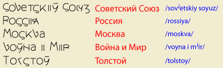
(For those who know Russian, the rightmost column is a transliteration, not a phonetic representation. Several of these words are affected by special phonetic rules; e.g. ‘Moscow’ is pronounced [maskvá].)
Now, Cyroman is an alphabet, not a spelling reform— you can just use the letters corresponding to the Roman alphabet if you like. But I envision the whole alphabet being taught, which invites the use of Cyroman single letters in place of digraphs.
E.g. instead of
you could write
A E K M O T X are the same in both alphabets, so they can be used as is. Letters that occur only in one alphabet (W Q Ч Ш Щ ъ ь) can also be left alone.
For B, the top of the Cyrillic character Б was curved and extended just enough to suggest a B to Roman-trained readers.
V is based on the Cyrillic lowercase handwritten character  , which is easier to turn into something that looks like a V.
D is narrower on top to suggest the same characteristic on Д.
Cyrillic for some reason doesn’t bother to have a real letter for yo, but uses Ё. Following the principle that ‘bottom-row’ letters should suggest the corresponding ‘top-row’ letter, I made the Cyroman character a variant of O, but also vaguely like ë.
J is zh (Ж) in Russian, but I tried to double up letters where possible. For the Cyroman, think of a handwritten J with a heavy serif.
The doubled I is not only closer to Cyrillic И, but solves an old typographic problem— the extreme narrowness of the Roman letter I.
Y is a graphic compromise, but it does unfortunately lose the relation of И to Й.
L and Л are hard to merge, at least until you conceptualize Л as a variant of Λ. Then it’s a matter of interpolating between the rotations.
N and Н can be merged by slightly rotating the crossbar; to avoid conflict H is given an opposite rotation.
What’s the counterpart of Cyrillic С, S or C? I’ve chosen S since С is always /s/. If I used C it would give Roman-trained readers the wrong idea about words like Союз.
Similarly, Cyrillic У can’t be equated with Roman Y, as we have to communicate that it’s a U. Note that the tail is longer in Y.
C for Ц is suggested by e.g. Polish, as well as the graphic similarity; it's a blockier curve in Cyroman. I considered matching Ц to Q instead, but that seemed like a stretch; or matching C to Ч, but that would get in the way of encouraging the use of new letters to replace digraphs.