|
| 
|
Elkarîl writing-- consisting of columns of grimacing faces-- may look at first like it is logographic; but in fact it is an alphabet, and indeed mostly featural.
Writing systems always have a preferred mode, and that of Elkarîl is carving in stone. The graphic at left, representing the word Elkarîl, may be taken as an example. The remaining examples are drawn in a simpler style, reducing the graphemes to their essentials; most elcari would consider these suitable only for children, or for ephemeral uses.
|
|
Basic syllables
Each CVC syllable in Elkarîl is drawn in the form of a face-- taking advantage of the hominid brain's ability to perceive faces quickly and easily as a gestalt.
The beginning consonant is shown by the shape of the top of the head, the ending consonant by the shape of the chin. Note the progression to flatter and flatter shapes the farther back the point of articulation. ø represents the lack of a consonant; these shapes are used for syllables beginning or ending with a vowel.

The nasals and liquids are represented by various headgear (initials) and neckwear (finals). (The liquids are represented by softer types of headgear such as turbans. The peak of the m recalls that of the p; the others are vaguely if at all related to the shapes of the stops.)

The vowels are indicated by the shape of the eyebrows and mouth. Here are all nine vowels, shown on the head-shape T-K:

The vowel sounds from u to i and thence to ê are used grammatically to indicate continuous semantic variation. This is reflected in writing as well: the face has a neutral expression for i (the middle ground in the full vowel series), becomes steadily sadder as the vowel backs to u, or steadily angrier as the vowel lowers to ê. The faces can indicate as many gradations as the artist can handle.
The e/o and ê/ô contrasts are often used for semantic opposites; the expressions are opposite as well.
Elkarîl uses vowel length as a means of focus or intensity. This too is represented graphically, normally by making the eyes more prominent:

The type of stop is expressed using diacritic elements.
- Voicing is indicated by a line above the brows, or below the mouth.
- Implosives, which developed from double stops, are indicated by two lines. For finals, one of the additional lines is used to open the mouth.
- Fricatives are indicated by drawing hair on the top or bottom of the head.
Here are all the variations on the syllable tek (showing lack of initial or final consonant as well):

As a demonstration of how the system works, here are a few sample CVC words. (These are the names for various mountain and hill types from the beginning of the grammar.)

Prefixes
Most prefixes and suffixes are written not with separate characters but by modifying the CVC face. Prefixes appear above or to the left of the face.
- The agentive n- is shown by a small fist.
- The feminine ch- is shown by narrowing the nose shape and thickening the lips; the masculine g- by addng a moustache.
- The negative t- is represented by an arrow. This is used rather than the ordinary t top-of-head shape if a syllable is actually a negative-- e.g. tôt 'no'.
- The conjunction p- is a left ear.
- The repetition q- is shown as a small square; recall that the q head-shape is square. This prefix can repeat multiple times.
- The genitive â- is indicated using one of the vowel shortcuts; these will be discussed below.
Here is the syllable kup shown with each of these prefixes:

Suffixes
Suffixes appear below or to the right of the face. The examples use the syllable shob.
- The nominalizer -a is a small ring (related to the surprised-looking a eyes); -u is a curved shape resembling the sad eyebrows used for syllabic u.
- The honorific -e or -(stop) is represented as a sword.
- The adjectivizer -sh is a pair of epaulets; note the fringes resembling the hair usually used for fricatives.
- The locative -ch is a crossed square (think 'you are here').
- The material suffix -m is a row of pebbles.

- The adjectivizer -r is a sort of pectoral shield, reminiscent of the r headgear.
- The despective -kh is shown by adding whiskers to the side of the face; a prolonged kh can be suggested by adding more.
- The repetitive -th is shown with a narrow hooked line; the length can be extended when the phoneme is prolonged.
- The causative -d is shown by two hands. (Some writers omit one of them if the syllable also contains the agentive n-.)
- The genitive -îl is shown with a castellation. (This suffix often identifies families, so the grapheme represents a dwelling.)

If a suffix isn't listed here or in the following sections, it must be represented as a separate syllable. E.g. there are no modifiers for -(r)idd, dde-, -ên, or -egg.
Object anaphora
Some Elkarîl words, notably the object anaphora and the word elkar itself, are formed using consonantal infixes; these are represented by modifiying the normal CVC face.
The examples in this section use the object anaphor xîk 'flat odd shape'.
- The infix r- is shown by drawing a tongue extending from the mouth.
- The infix -l is indicated by adding a nose ring.
- The infix -n is shown by adding teeth (usually two).
 Object anaphora (and other words) can be made more precise with location suffixes:
- The location suffixes -êb (top), -îd (middle), -ôg (bottom) are shown by a drawing of a bar, with the appropriate section highlighted, e.g. by enlarging it.
- The 'one-half' suffix -iph is drawn as a bisected bar.

Assignment anaphora
The anaphoric reference suffixes are drawn as a small circle with a symbol recalling the eyebrow position for a main vowel drawing.

The assignment morpheme -qeb- is drawn as a separate face, with the vowel abbreviation circle attached to it.
Numbers
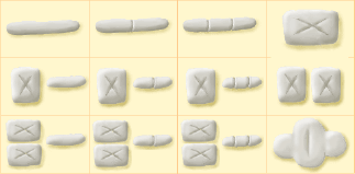
The numbers are shown in two forms, carved and written. All the carved numbers are based on the repetition of the unit bar; the lozenge used for 4 is simply a simplification of a stack of four bars, and the diamond-shaped symbol for 12 represents three stacked lozenges.

There is a fair degree of freedom in the arrangement of the elements. Some writers prefer to keep the numbers as horizontal as possible; others stack them in order to take up an entire face-position. Or, they may be placed to the side of the column of faces.
The written numbers are sketched approximations of the carved forms. The graphemes shown would be used for quick tallying or calculation; for permanent records, forms closer to the carved versions are used.

The plural morphemes-- the dual -êj and the quartal -âj-- may be written with a small 2 or 4 character attached to the bottom of the face.
There are two ways to write larger numbers. One is simply to write out the words, using the above symbols for the digits. E.g.
nquj path-mpêq cherâj ggêth-mpôq
five 12-seven 122-quartal 123-eleven = B47512 = 30580
would be written with the underlined words as digits, and the remainder as faces.
The alternative is to write the digits only, lowest to highest. In this case a vertical bar or line is used for mem 'zero'.

An example
At right is a sentence in Elkarîl, drawn from the examples.
Ruch phimqebat tul-kugg p-têt-jênat lek.
climb thing (=A) on-away-peak and-not-have-A foot
I climb the mountains, but I have no feet.
Artistic variation
My renderings of the Elkarîl characters are intended to abstract out the basic elements of the script in a representative form. In practice a bewildering variation exists; the elcari use their script decoratively, and love to elaborate the characters as much as their considerable artistic skills allow.
A bare minimum is to use more representational heads or to stylize them in various ways; this is hinted at in the graphic at the top of the page, showing the word Elkarîl as a carved bas-relief.
The elcari most admire texts where the art enhances the message, either reinforcing it or contrasting with it. The faces generally look a bit fierce and intimidating; but expressions and features can be modified to match the referents. E.g. the word nmurthankh `múrtany' is usually drawn as the face of a múrtany. A person's name may be a portrait of the person; things said by someone may be given the same treatment. Faces may be made uglier if they refer to unpleasant things. A battle commemoration may show the faces armored and scarred.
Occasionally entire bodies are drawn, sometimes uniform, more often in varied poses and costumes. This provides an opportunity to introduce props or clothes which complement the text; sometimes the figures even act out the events referred to by the text, or comment on it with hand gestures.
Though the fullest elaboration of the script is architectural, carved in stone or wood, it can be drawn or painted as well. Fonts have been created to allow printing, but the elcari do not like printed books very much, as they do not allow much differentiation of the characters. (Wood-block printing, with each block of text carved as a unit, is acceptable.)
© 2003 by Mark Rosenfelder


