
| April 2005 |
|
| Rich Burlew : The Order of the Stick | |
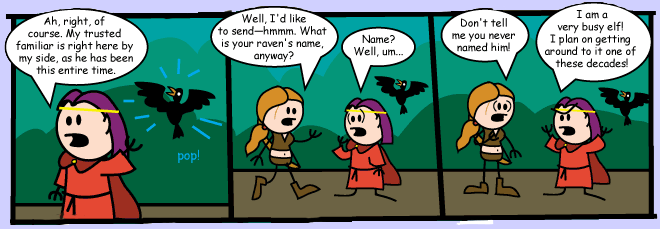
So it's a pleasant surprise to find one that doesn't. Order of the Stick is a cute, unpretentious comic about D&D. (It probably won't make a lick of sense if you don't know anything about the game.)

The strip follows a group of typical adventurers-- most notably Haley the rogue archer babe, Belkar the halfling with a 'tude, Elan the near-useless bard, Vaarsuvius the magic user, and Roy the fighter. They're all quite aware that they're in a D&D game, and bicker over the rules much as players do. (Nonetheless the gloves don't come entirely off-- the actual gaming situation stays offscreen.)
The characters are drawn much like Fisher-Price Little People, with round heads and square bodies and sticks for arms and legs. Very likely Burlew, like many a web comic artists, can't draw; but at least he's not using this as an excuse for lazy production. The strips are long and expertly colored, and the expressive, cartoony drawing fits the lightness of the material perfectly.
It probably doesn't hurt that there's an actual story underneath. You end up actually rooting for this little gang, and hoping they make their next Fort throw.
If you like OOTS you'd probably like Dungeon, by Lewis Trondheim, now available in English. It's not about D&D per se, but the nature of the Dungeon will be very familiar to D&D players.
(By the way, if you're wondering why most web comics suck, I think it's a) underambition, and b) a low entry barrier. Most of them seem to model themselves, for no good reason, on newspaper comics: cheap and easy gags, quick and static art, and unchallenging storytelling. And some don't make it even to that low level.)
Update: If you can't hack Burlew's increasingly erratic updating, just wait for the TPBs instead. There's three books out already and undoubtedly more to come.Also see the sketch Burlew drew for me.
| Roy Lichtenstein : Various stolen & expanded panels | |

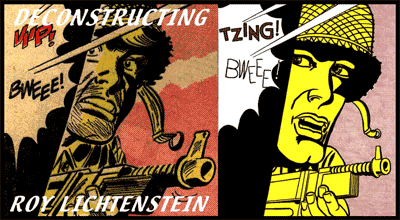
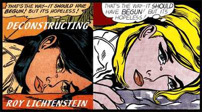
What I found surprising here was that in most cases, the comparison goes against Lichtenstein. Side by side with '50s hack cartoonists, he doesn't look that great.
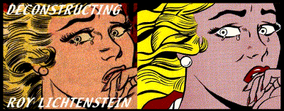
 For one thing, the draftsmanship is frequently poor. The faces of the women are distorted and unnatural; the lines aren't in proportion; the lettering is too spidery. (In the sample at left, note the eyes: the eye on the left in the original is not well drawn, but the lines on its right edge are clearly meant to show the upper eyelid and eyelashes; Lichtenstein's version looks like she's been injecting steroids and grew a new muscle.)
Comics designed for cheap newsprint reproduction have a certain iconic power that Lichtenstein undoubtedly found attractive. Sometimes he cleans up the composition; but more often it's the original that makes a more striking image.
 And ironically, the originals often look softer, more subtle, more detailed. In the same sample, for instance, the flesh tone is better in the comic, the colors more appealing, the angle of the head more interestingly oblique. Lichtenstein's hair looks like a failed macramé project. Similarly, the original soldier (top sample) is more expressive and more dramatic, and the colors work much better though they aren't much more complex.
And Lichtenstein doesn't seem to have realized that the yellow tint of newsprint is a necessary counter to their iconic lines and masses of color. That's why early superhero comics look so cheesy printed on bright white paper. The best comics have learned to use deeper, more varied hues (e.g. Hellboy), or to up the quality of both art and color (e.g. Michael Zulli or J.H. Williams III).
Another oddity: Lichtenstein frequently replaces brunettes with blondes. Could he be an unknowing agent of the mythologization process, helping to turn the '50s into an exaggerated version of itself? Or a very knowing agent, as a correspondent suggested? Or maybe he just likes blondes.
